Colour Trends for 2017
 It's December. That's actually shocking to me. On November 2nd, I celebrated my one-year-not-working-for-the-man-iversary. An entire year of answering to only myself.Well, myself and my amazing clients of course. They run a tight ship, just kidding, I honestly have the best clients of all time. You know who you are, and I love you all.Oh, and if you're not my client but you're reading this, I love you too!Ok, stay on task, Michelle!It's time to talk colour trends for 2017...à la Benjamin Moore and à la Pantone.
Let's start with Benjamin Moore Shadow 

 I'm so into this colour. First of all, I am in love with dark, saturated colours right now, they are a really beautiful contrast to my love of crisp, bright white walls.But I wouldn't paint just any room this colour, I would do an entryway, office, powder room, bedroom or even the front entryway door. I've been really drawn to using saturated colours as peekaboo colours in a home. Below is an example of what I mean.I like the use of a saturated colour when you you have an open entryway connecting two rooms; one room is a really light colour but the attached room (the peekaboo room!) is a dark saturated colour.
 Here's some more colour trends from Benjamin Moore...I blogged about Gentleman's Gray with last years trends.
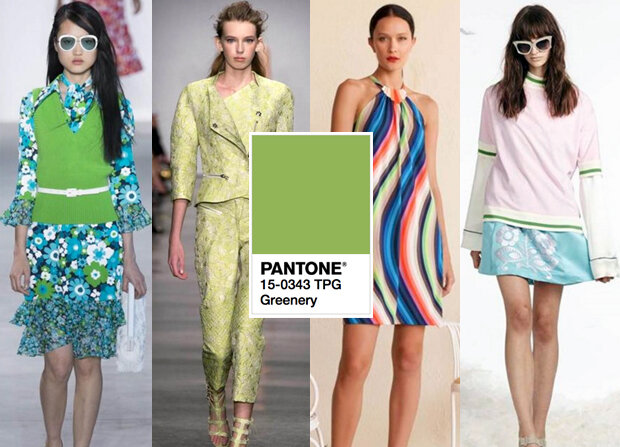
Let's talk Pantone 15-0343 Greenery

 I'm having mixed feelings about Pantone's colour of the year, I've worked for two national franchise's both of which used a very similar colour for their branding. It's taking me back 10 or so years ago and gives me a corporate feel which I'm just not into as far as residential design goes. It's not that I didn't like those jobs or those companies, but I think it's just putting me in a real corporate place. On the flip, I do really love the use of this colour in fashion!So ya, mixed feelings.Oh ma ga! I just remembered my lime-green phase after college! I had one of Ikea's tv stands in lime green (tried to find it in google with no luck) and I had accents throughout my apartment. Ugh, I so loved that apartment, I wish I had photos. It was a bachelor apartment, and it was down the street from my favourite bar (Jim Bob's for anyone from London, Ontario). Wow. Blast from the past or what.
 Ok, I'm back on task...I do like the use of it with this kitchen cabinetry, but I don't love how all the colours come together in this space.Would I ever recommend this colour for a client?No, probably not.
 No!!!This wall colour is a hard no for me. I'm just not into bright colours like this for walls in a home, feels a bit juvenile, I would prefer to find a more neutral wall colour here and have this colour infused with the accents you see.So, what do you think...Yay or nay to Benjamin Moore's Shadow?Is Pantone's Greenery just a bit too 10 years ago?Let me know what you think!